US Map Mislabels Every African Nation at Global Aids Conference
A US State Department map displayed at a global conference in Brazil incorrectly placed every African country, sparking widespread criticism.
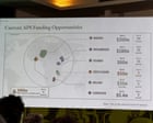
A U.S. government map of Africa that mislabeled every country was displayed during a State Department presentation at a global conference in Brazil this week, prompting confusion and criticism among attendees. Screenshots of the erroneous map quickly circulated online, highlighting significant geographical inaccuracies.
The map was shown during a presentation at the Aids 2026 conference in Rio de Janeiro, midway through a discussion on the State Department's new health agreements. A Reuters review of a video of the presentation revealed the map bore an artificial intelligence watermark, suggesting it was generated using OpenAI tools.
Among the numerous errors, Nigeria, a country with a significant U.S. troop presence, was depicted as landlocked within the Sahara Desert. Mozambique, located in southeastern Africa, was placed in the Horn of Africa region, while Côte d'Ivoire, a West African nation, was shown on the opposite side of the continent. These inaccuracies were first highlighted by Aids expert Emily Bass in a Substack post and subsequently gained significant traction on social media platforms like LinkedIn.
The State Department has acknowledged the error, stating it takes "full responsibility for the confusion and misrepresentation it caused for attendees, including our African partners." An internal explanation suggested that a team member hastily altered the slide deck before the event, leading to the inclusion of the flawed map.
Experts and observers expressed dismay at the map's inaccuracies. Matt Petit, who specializes in AI and geopolitics at the Atlantic Council, commented on a widely shared post that the creators of the slide appeared to lack basic geographical knowledge of Africa and did not verify their work. The incident has raised questions about the vetting processes for materials used in high-profile diplomatic and health-related events.
The presentation featured Jeff Graham, the top U.S. health envoy responsible for overseeing the President's Emergency Plan for Aids Relief (PEPFAR). The display of such a fundamentally incorrect map at an event focused on global health initiatives, particularly those involving African nations, has drawn particular attention.
While the State Department has attributed the error to a last-minute change by a team member, the incident underscores the potential pitfalls of using AI-generated or unverified visual aids in sensitive international contexts. The lack of rigorous fact-checking before presentation has led to embarrassment and highlighted a need for improved quality control.
This geographical blunder at a major international conference serves as a stark reminder of the importance of accuracy in diplomatic and informational materials. As the U.S. continues to engage in global health and foreign policy initiatives, ensuring the integrity and correctness of information shared becomes paramount, especially when presenting to and collaborating with international partners.
This article was written by AI based on publicly available news reporting. Original reporting by the linked source.